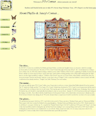
PJ's Corner is a small family run business that offers handcrafted dolls, books, greetings cards, stationery and the like. PJ's is based in California and run by mother and daughter combo, Phyllis and Janey Fisher. I mention it is a family run business because, as the site says itself, I get the impression that family, in particular children, is very important to these guys. The site, just like the products it sells, has a rustic and careworn appearance. The products are skillfully made to last - no cheap and flimsy plastic anywhere to be seen. I get the impression that PJ's Corner is a labour of love - making money is very much a secondary consideration to the satisfaction they glean from having their merchandise appreciated. Appreciated it certainly is, judging by the comments left in the guestbook. I think nearly all of the artwork has been done by Phyllis and she's done a tremendous job on it. Phyllis is also the main author and illustrator of children's book "Twiglet" the Little Christmas Tree. The site also includes a free colouring page for the little ones to enjoy.
Now for some practical points about the site. The pages are made of frames but unlike most frames, where you can see a distinct boundary between the elements, the frames in this case merge into one. I find that unusual - not necessarily a negative point, just kind of weird. There's a pop-up on the homepage. I'm not a fan of pop-ups because, unlike other content, you have no choice about viewing them. The link button labelled 'PJ's Store' actually points to 'About PJ's'. The ticker tape hesitantly stumbles along - not smooth scrolling like it should be. The text is all in the Times font - I think this could be varied to draw more emphasis to important paragraphs. I also think it should be justified, to avoid an unsightly mismatch of line lengths.
The pages might appear primitive to some, but I recognise that they reflect the traditional, homely feel of the merchandise. Complicated JavaScript, loud colours and animations would certainly be out of place.
This is a popular site and the traditional appearance has obviously served it well. I wish PJ's Corner continued success in the future.
I conclude by giving an honourable mention to the second site Janey asked me to review, Starlo's Cockapoos. If you like dogs and puppies I recommend having a look at this site too.


No comments:
Post a Comment