Nature’s Wallpaper
http://natureswallpaper.blogspot.comDescription of site:
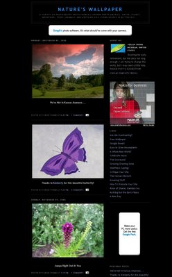
The author has taken photographs of various plants, animals and landscapes in North America. An entry containing a new photograph and brief annotation is made nearly every day.
Appearance:
In a word, minimalist. A very simple template has been used. The page background is black which tends to contrast, sometimes distractingly so, with objects placed on top. This is particularly evident with the white and blue AdSense referral buttons which ‘stick out like a sore thumb’.
Organisation:
N/A
Navigation and Functionality:
Side bar links and blog archive.
Advertising:
Google AdSense referral buttons at top, side and search bar at bottom of page. There are also several affiliate type adverts. No effort has been made to blend the ads with the page – as if the author is trying too hard to attract attention to them.
Comments:
The photographer obviously has a very keen eye and has taken some beautiful shots, some of them in very fine detail. I particularly like the vibrant colours of the plants and close ups of the insects. The images on here would make a fantastic slide show, but as it is I can’t ignore the canvas underneath – I just can’t figure out why someone with such artistic flair would choose a black background with horribly contrasting embeds. I would have chosen a pastel green or blue to reflect the nature theme of the photos.
Rating:
6/10
Reviewer:
Sam


No comments:
Post a Comment