Letters I Wish I’d Sent
http://bfwg.blogspot.com
Description of site:
Bob, the author of the site, has the urge to write letters every now and then. Mostly he writes about niggling irritations in his life, but sometimes he writes complimentary letters too. Quite often he realises there is no point in sending his letter, for fear it will simply get tied down in bureaucracy, failing to reach the intended recipient. Even if it does reach the intended recipient, there is a realisation they might just ignore his offerings. These are Bob’s thoughts on different subjects he feels strongly about.
Appearance:
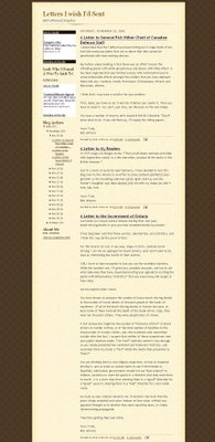
One of the basic original Blogger templates. Sepia tone with background flowers. I can understand why the template has been chosen – to project an air of formality in his letters. I personally find the colour scheme slightly bland and recommend an alternative. As this is a collection of letters there are no images posted.
Organisation:
N/A
Navigation and Functionality:
Sidebar to left of page. The archive is broken down into individual days instead of months – I would change the archive format to show less detail.
Advertising:
Google AdSense ad units at the top left of sidebar. AdSense half-banner at base of page. The ads are well blended and don’t disturb the appearance of the page. A point to note is that Public Service Ads (PSAs) were showing when I viewed the site. The author will struggle to make any profit by showing PSAs. There might be a problem delivering targeted ads because of a lack of keywords in the content.
Comments:
This is a requested review.
The author has struck on a good idea here – a definite and novel theme that will run through the blog fairly timelessly. It should work well in the long term but sadly, due to the young age and limited content, it is difficult to comment in too much detail. Letters are a very personal matter and the idea of making your innermost thoughts available electronically is bound to attract a loyal audience with similar views.
The writing is of a high standard, although slightly Canadian bias – not a criticism, but it may limit the appeal of the blog outside of North America. To compliment the quality serious content there are some nuggets of humour. I particularly note the letter to Dona Highstone, commenting on how she managed to lose an election to a deceased rival and the letter to the author’s friends for asking stupid questions.
As I eluded to in the appearance comments above, I understand why the colour scheme and template were chosen – to project an air of formality in the same vain as the letters were written – but it isn’t too pleasing on the eye. I recommend migrating to Blogger in Beta for a few reasons – it has a greater range of templates, it is easier to use, has greater functionality and requires less understanding of code.
Bob, please submit this for re-review in a few months time when I can probably give a higher rating. In the meantime, at least you’ve got a little extra publicity for your work.
Rating:
5/10
Reviewer:
Tom


2 comments:
Hi, Tom
Thanks for the review. I don't disagree with any of your comments. In fact, I did the migration to beta this morning, and I agree that the look is better. I will definitely submit for a re-review in a couple fo months.
Thanks again.
Bob
Not an unfair review, I will say that the humour translates very well to me in UK. Look forward to reading more.
Post a Comment