Feature on Soapbox Jury

If you would like us to review your website, blog, product or service please email us.
If we're able to publish your review all we ask is that you link to Soapbox Jury in return. Please read here before submitting.

Blog Review: Erika Jean


Erika Jean
http://spillitnow.blogspot.com

Description of site:
The personal journal of Erika, a 21 year old student at the University of Cincinnati reading Criminal Justice.

Appearance:
Custom Blogger template with blue and white colour scheme. Attractive personalised blue header with tabbed browsing buttons.

Organisation:
Neatly organised with short and snappy entries instead of long ramblings.

Navigation and Functionality:
Sidebar links and blog archive. Closer inspection of the browsing tabs reveals they aren't actually for browsing at all – they lead to things like Erika's wish list and the
Cincinnati weather report.

Advertising:
No obvious signs of monetisation. There are a few directory referral links on the sidebar but nothing too overwhelming.

Comments:
This is a much more personal blog that I've read before. The archive begins in July 2006 and within the first month we have learnt that Erika is missing her sister Lisa badly. Lisa has just gone off to join the Army and her basic training is 500 miles away in
South Carolina. Erika is a community assistant on campus (apologies for the UK interpretation) - a job with a large room and zero rent which unfortunately also attracts a shared bathroom. Some of her neighbours aren't so hygienic and leave the place in a mess for Erika to clean up. This brings back fond memories for me too!

At the end of August you'll find some of Erika's handy work in the form of some photos. I particularly like the black and white shots with the objects highlighted red. September heralds a change of tact on the blogging front – the appearance of the first lists. Lists are a common defence mechanism to stave off blogger's block but I'm pleased to report that instead of predictable and irrelevant waffle Erika's lists actually appear interesting. They give a nice little insight into her life. I particularly like the article entitled ‘what’s in a name?’

In October you'll find how closely Erika's photo matches that of well-known celebrities. She's pretty close to Katie Holmes and Catherine Zeta Jones according to the technical wizardry, although I am struggling to see how Dakota Fanning (whoever she is) has an 83% similarity! There's also a scary moment when Erika takes a tumble down some stairs but luckily manages to escape without any long term damage. Erika reveals the contents of her handbag in November. I’ve always thought that a handbag was a very sentimental and private thing to a lady. Not much to report on the content front, apart from Erika carries 2 name badges and book called 'The Man of My Dreams' (I’m here by the way).

The most recent entries are some of the best – Erika allows all of us 'old fogeys' (British saying) to get reacquainted with Tetris. Ahh, how those memories of Super Mario, irritating music, flashing graphic and my Super Nintendo come flooding back. Erika Jean has to be worth a visit just to play this. Overall, a solid performance from a new incumbent to the blogosphere. Perhaps lacking in content in the early days, but it's full steam ahead now as Erika attracts a large following of comment leavers. I wish Erika Jean many visitors in the future.

Rating:
7/10

Reviewer:
Sam


Blog Review: WebTipedia


WebTipedia
http://webtipedia.com

Description of site:
An online collection of resources for computer users. The site appears to be aimed towards the internet/computer newcomer because most of the tips are pretty elementary.

Appearance:
Custom WordPress template with white and grey colour scheme. Sidebar with category buttons and links located at the right hand side.

Organisation:
Neatly organised with good classification of posts for easy location.

Navigation and Functionality:
Sidebar links and blog archive. The tabbed header and sidebar category buttons allow smooth navigation between pages.

Advertising:
Monetised with Google AdSense. Ad units at the top and bottom of the sidebar, link unit on the header bar.

Comments:
This is very similar to another blog I frequent called the Useful Blog. The concept is sound – the bringing together of handy online resources to one site. However, from the few entries that exist so far, it seems there's nothing really revolutionary on here. We get handy tips about Internet Explorer shortcuts, spy ware removal, music downloads and open source software but there is nothing mentioned that any computer user worth his/her salt isn't going to know already. This leads me to believe WebTipedia is targeted at the computer newcomer, which is no bad thing but it's a somewhat limited audience for a website.

As for the site design itself, I like it. It is neatly arranged, uncluttered, with good navigation and not crammed with ads. One suggestion I would make is to justify the post text – uneven line lengths are unsightly and easily cured.

This combined with the infrequency of postings is reflected in the rating I award. I'm sure WebTipedia will increase in popularity in future months, but after 3 months and only 15 or so posts it's too early to say much more.

Rating:
6/10

Reviewer:
Sam


Quick Review: Belisi


This post is sponsored by Belisi. To see our policy on sponsored entries click HERE.

If you're after an extra elegant treat for the special person in your life try the Belisi brand of quality neck ties and scarves. Belisi have a huge array of ties and scarves to choose from, all in the finest quality woven or printed silk and equisite contemporary patterns. Whether you're interested in modern abstract art or simple stripes, their comprehensive online store is bound to have something of interest. The price, particularly of the printed range, is nothing to be scared of either. Once you've viewed their products have a look at their blog on women's fashion - it will keep you up to date with the latest styles on the catwalk.

For silk ties, scarves and women's fashion visit the Belisi website.

Blog Review: Mustang 'N' Cowboys


Mustang 'N' Cowboys
http://mustangncowboys.blogspot.com

Description of site:
A story charting the training of mustang horses in
California.

Appearance:
Our old favourite Blogger template with the flowers on the brown background. Pictures of the animal 'cast members' on the left sidebar.

Organisation:
Neatly organised. One point to note is that in some posts the text has written over the images – it would be nice if this could be remedied.

Navigation and Functionality:
Sidebar links and blog archive.

Advertising:
Google AdSense ad unit and a few directory referral banners are located on the sidebar. Nothing too over the top.

Comments:
The first few posts set the scene nicely – Travis and Tony, the author's grown-up sons, are set for a two week adventure on horseback in the John Muir Wilderness Area. We are also introduced to the horses Belle, Coal, Clancey, Maggey and Cahlibur. The sidebar pictures and notes help get a feel of what the blog is about. One of the first challenges for the horses is back-pack training – carrying around large panniers of sand to get them used to the weight before the expedition. We also get an insight into what equipment they need for two weeks of self-sustainability in the
California mountains.

The rest of the blog is a rolling diary of how the trip and aftermath pans out. Both Travis and Tony contribute to the writing, and there are regular interjects from their mother Janey's perspective away from the action. It is evident that they kept a thorough journal of notes and photos as they went along – all the action is caught first hand. Their days consist of 6 am rises, feeding and watering the horses, packing their kit and either exploring the surroundings or completing the next stage of their journey. I enjoyed reading about their campcraft skills in particular – the gathering of firewood, setting up of camp, cooking and fishing. Things get off to a shaky start when the insect repellent is lost. It sounds kind of like Ray Mears Bushcraft TV programme back here in the UK. By day 6 it is becoming evident that the horses aren't enjoying the challenge as much as Travis and Tony are – Maggey is off her food, Coal has a sore back and Calhibur's girth is painful. They decide to cut the trip short to get the horses home and comfortable. Maggey's troubles persisted and she ended up collapsing on a mountain pass. After hours of trying to coax her back to her feet they managed to get her moving again but not for long. Sadly, Maggey never made it home. I shan't spoil the rest of the story but the two sons arrive back from their adventure and disappear off to do some cattle ranching (if that's the expression). Janey is left to tend to the horses and a few new furry additions to the family.

Rating:
7/10

Reviewer:
Tom


Web Review: PJ's Corner


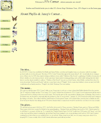
PJ's Corner is a small family run business that offers handcrafted dolls, books, greetings cards, stationery and the like. PJ's is based in California and run by mother and daughter combo, Phyllis and Janey Fisher. I mention it is a family run business because, as the site says itself, I get the impression that family, in particular children, is very important to these guys. The site, just like the products it sells, has a rustic and careworn appearance. The products are skillfully made to last - no cheap and flimsy plastic anywhere to be seen. I get the impression that PJ's Corner is a labour of love - making money is very much a secondary consideration to the satisfaction they glean from having their merchandise appreciated. Appreciated it certainly is, judging by the comments left in the guestbook. I think nearly all of the artwork has been done by Phyllis and she's done a tremendous job on it. Phyllis is also the main author and illustrator of children's book "Twiglet" the Little Christmas Tree. The site also includes a free colouring page for the little ones to enjoy.

Now for some practical points about the site. The pages are made of frames but unlike most frames, where you can see a distinct boundary between the elements, the frames in this case merge into one. I find that unusual - not necessarily a negative point, just kind of weird. There's a pop-up on the homepage. I'm not a fan of pop-ups because, unlike other content, you have no choice about viewing them. The link button labelled 'PJ's Store' actually points to 'About PJ's'. The ticker tape hesitantly stumbles along - not smooth scrolling like it should be. The text is all in the Times font - I think this could be varied to draw more emphasis to important paragraphs. I also think it should be justified, to avoid an unsightly mismatch of line lengths.

The pages might appear primitive to some, but I recognise that they reflect the traditional, homely feel of the merchandise. Complicated JavaScript, loud colours and animations would certainly be out of place.

This is a popular site and the traditional appearance has obviously served it well. I wish PJ's Corner continued success in the future.

I conclude by giving an honourable mention to the second site Janey asked me to review, Starlo's Cockapoos. If you like dogs and puppies I recommend having a look at this site too.

Blog Review: Sunflower


Sunflower
http://smilingsunflower.blogspot.com

Description of site:
As Sunflower puts it herself: a site to share her rambling thoughts, experience and fun with friends. I am going to refer to the person Sunflower as 'the author' from now on otherwise, with the blog sharing the same name, it could get confusing.

Appearance:
Custom 3-column Blogger template. The left hand side bar has many, many links and several BlogRolls. The right hand sidebar has a flickr album, a few pictures and various ads.

Organisation:
Neatly organised. The central column is slightly out of proportion compared to the lengthy sidebars – the author may like to consider scaling down the central column content by including fewer posts per page.

Navigation and Functionality:
Sidebar links and blog archive.

Advertising:
Amazon Associates ads dominate the right hand sidebar, but aren't imposing on the post text. The author has recently started including sponsored posts - these are irregular and greatly outnumbered by regular posts.

Comments:
I am always concerned when I'm asked to review a site like this – what right have I, a newish blogger from the
UK with limited experience under my belt, to critique a blog of the stature of Sunflower? This is a quality blog – it must be because it has a Technorati ranking in the top 6000. Considering Technorati is tracking nearly 60 million blogs that is no mean feat. I am more than humbled that we have received a back link from Sunflower! It just goes to prove that just as you can't judge a book by its cover, you can't judge a blog by its PageRank. Sunflower is a PR0 site – I couldn't believe it either – they appear, at first glance, to have been robbed by Google. But when I look closer I think I can explain the disparity between the Technorati and Google rankings. Technorati judge a blog on how many links it receives whereas Google assign a value to each of those inbound links and also consider the outbound links. Sure, the number of Sunflower inbound links is huge but the number of outbound links is equally mammoth. As a rough rule of thumb outbound links cancels out inbound links under Google's PageRank system. I suspect that nearly all the links on the BlogRolls, of which there are literally hundreds, are reciprocal links and therefore of limited value in Google terms.

I am amazed that such a young blog has had almost exponential growth in its popularity and following. I think the reason for Sunflower's success is very effective, although not necessarily efficient, link exchanging. The author must have worked 24 hours a day promoting her blog and exchanging links. Even more surprising for a blog with such high Technorati ranking is that content is so thin on the ground – I had to double check the archive but there really are no posts in June or August 2006. There is only one post in each of May and September 2006. I could be mistaken here, and apologies to the author if I am, but has some of the content got lost in cyberspace?

Now for content. When I review a blog I always skip to the beginning of the archive and read the introductory post to develop an expectation of what lies ahead. Sadly Sunflower has the briefest of introductions and doesn't reveal much of the background story. Apart from that I like April – it is contextually broad, ranging from art (van Gogh's Sunflowers) to science and nature (the life cycle of the plant) to cookery (green papaya salad). I also learn what a baby shower is – I've heard of one before, but never had the gumption to ask. We learn that the author is busy looking for employment, which would explain why she was distracted from blogging. May consists of one post, charting the author's lack of job hunting success but trying to remain positive. Skip forward two months to July and we have a single post on the Tom Hanks movie, The Green Mile. It's a tremendous film and I know it word for word. The author writes a detailed, descriptive and accurate review of the movie. Fast forward to September and the movie Contact is kind of reviewed. The review this time isn't so much about the movie, more of a reflection on how it relates to the author's life. Our next encounter occurs in November. November gets off to a good start with a solid, educational post on the Amazing Journey of the Salmon. Between now and then the author has really been getting in the blogger groove, with daily posts and regular participation in 'Wordless Wednesday', 'Thursday Thirteen' and 'Click and Comment Monday'. The numbered lists that typify so many musing blogs also make an appearance. The final Christmas touches are added by some nice wintery photos of Vancouver – wrap up warm before looking at those.

I am awarding Sunflower an 8/10 based partly on the people's Technorati vote - democracy in action! I can't award a 9/10 because I don’t think the inbound links give a true indication of Sunflower's popularity – more a reflection on how many blogging circles and link swaps the author has engaged in. Another consideration in my rating is the lack of content in the archive, which can't be compensated for by the flourish of recent activity.

There is no doubt at all that Sunflower is a quality publication with a loyal following. It has really taken off in the last month or so and I wish the author perseverance and success for the future.

Rating:
8/10

Reviewer:
Sam


Blog Review: Honey Bryan


Honey Bryan
http://honeybryan.blogspot.com

Description of site:
The personal blog of Bryan (AKA Kit), a freelance IT consultant from Singapore. Along the way Bryan hopes to chart his route to becoming a millionaire. The power of positive thought.

Appearance:
One of the standard Blogger dots templates. The author has tried to customise the header by inserting a 'dribbling' honey image annotated with the words Honey Bryan. The image is really the wrong size and doesn’t occupy the header correctly.

Organisation:
Neatly organised, but not difficult to achieve owing to the lack of content.

Navigation and Functionality:
Sidebar links and blog archive.

Advertising:
Google AdSense ad units present at top, bottom and sidebar. AdSense link unit located half way down the sidebar. AdSense for search box located towards top of page.

Comments:
This blog starts off slowly with a few one line entries and pictures. It's difficult to decide which entries are one liners because the author seems to start a new paragraph after every sentence. After only 4 posts and no more than 10 (full) lines of text Kit kindly points out the donation button on his site. You'd be forgiven for thinking this is a bit cheeky, considering the scarcity of his material, but you've got to admire the guy's audacity – after all, you don't become a millionaire without walking over a few people! The weird thing is that there isn't actually a donation button there – just some AdSense ads. Hmmm suspicious.

The first post that draws my eye, it being Christmas and the fattest time of year, is about an Iced Tiramasu Latte from the Coffee Club. This thing looks absolutely gorgeous and stands about 30 cm (6 inches) tall, with three distinct sickly-sweet layers. It's the sort of thing you can enjoy at Christmas without feeling too guilty. That post also includes a photo of Kit and his Beauty Queen enjoying a Kit Kat – spot the play on words? In quick succession we have another good post – this time a YouTube embed. The video shows the John West tinned salmon commercial where the bear does a kung fu style defence of his fish – worth a look if you haven't seen it already, although I suspect most people have. He also delves into a YouTube Karaoke moment with a 50 Cent song. I particularly like the way Kit introduces the blogs of his friends and tries to get them a bit of traffic by providing a mini-review.

October heralds a change of tact – the focus now is funny imagery and, give him his due, Kit starts with a classic – see 3rd Oct entry. Some other funnies towards the end of the month too, with P Skool Maths springing to mind. The list of Men’s Rules is also noteworthy for its humorous dig at the fairer sex. November is a quiet month with irregular posts – a few more funny images like JussiPussi bread rolls.

Despite Kit saying he was going to chart his progress to becoming a millionaire, this isn't really the main focus of his blog. It isn't a 'get rich quick' kind of blog, which is nice because there are already too many of those. It's more a mix of humorous pictures, music and movie reviews and a few personal comments about his life.

I don’t know if Kit is aware that there seems to be some formatting problem which means I can only see some posts as a mass of question marks – this, and the fact original content is irregular and limited, is reflected in the rating I award. I wish Kit and his Beauty Queen happiness in the years ahead and continued success with his blogging.

Rating:
5/10

Reviewer:
Sam


Blog Review: The Million Dollar Experiment Heads Down Under


The Million Dollar Experiment Heads Down Under
http://millionnzdollars.blogspot.com

Description of site:
New Zealander Rob StGeorge has set out on a quest to see if it's possible to make a million dollars using a free blog site. This blog is record of his progress to date.

Appearance:
One of the standard Blogger in beta rounders templates with a custom header.

Organisation:
Neatly organised with a good flow of focused posts. I particularly like the regular progress reports.

Navigation and Functionality:
Sidebar links and blog archive.

Advertising:
Just as you'd expect advertising is a very key part of the Million Dollar Experiment. This blog is monetised by Google AdSense, Blogsvertise, Blogitive and Money4blogs. Rob also includes a donate button at the end of every regular post.

Comments:
I've been following Rob's experiment since the outset and have been intrigued by his different money making strategies and hooked on his regular updates. He's not quite a millionaire yet, but he's slogging away making a little every day. I hate to sound negative, but I think even Rob would acknowledge that the chances of him becoming a millionaire are somewhere between slim and non-existent. At least in the meantime he is providing a valuable testing service and feedback on the different monetisation schemes available. If you would like to earn a little from your blogging – not a fortune, but enough to cover your hosting and other expenses – you could do a lot worse than checking out his recommendations. Some people will disagree with this type of blog on principle but at least it is open, honest and does exactly what it says on the tin.

Despite being regularly updated Million Dollar Experiment is still fairly new, lacking in content and progress is slow. Notwithstanding this it has a regular following of loyal comment leavers and is well publicised in the directories. Its new status, lack of depth and slow progress to date are reflected in the rating I award. I am also mindful that some readers will see it as just another distracting money making blog. I wish Rob every success in his continuing mission and hope he has the perseverance to see it through.

Rating:
6/10

Reviewer:
Tom


Blog Review: The Broken Cup


The Broken Cup
http://thebrokencup.blogspot.com

Description of site:

A collection of inspirational Christian poetry, some short stories and Bible passages.

Appearance:
One of the original Blogger templates. Sepia tones with background repeating floral pattern. Although it isn’t one of the more colourful or exciting templates, it serves its purpose well on such a serious, dignified and purposeful blog.

Organisation:
N/A

Navigation and Functionality:
Sidebar links and blog archive.

Advertising:
There are a few directory referral buttons and freestanding ad banners located on the sidebar. Two banners and a WebRing search bar are located at the foot of the page. The site does not appear to be monetised.

Comments:
This is a requested review.

This blog is a collection of short poems (mainly), stories and Bible readings. The blog is fairly new, but the inspirational postings have attracted a wide following and frequent comments already. The poems are the personal work of the author unless stated otherwise. The message they convey is crystal clear and food for thought. Notable poems that struck a chord with me are ‘The Unwelcome Visitor’ and ‘Upon Awakening’. It’s definitely worth a look if you are a Christian who likes poetry.

Since this is such a new blog, with religious content and a targeted Christian audience it is not appropriate for me to award a rating.

Rating:
N/A

Reviewer:
Tom


Quick Review: Seasoned Trades

This post is sponsored by Seasoned Trades. To see our policy on sponsored entries click HERE.

Despite this being a sponsored post I think this one is going to fall foul of the Soapbox Jury honest, down to earth approach of product and service review. Seasoned Trades is a service that claims to be able to improve your credit rating after financial difficulties. They mention bankruptcy in particular. The theory is that if your credit rating is restored, you'll have no problems in the future when you want to gain more credit. As Season Trades puts it 'prime credit is priceless' - this is just before they reveal their prices, which are anything but priceless. A vicious circle I think the expression is. If you want to enter a downward spiral of paying money to be able to borrow more money, which you'll then have to pay back as well, then Seasoned Trades might be of interest to you.

Despite the critical review, at least they got their link in Soapbox Jury - that really is priceless!

Blog Review: Fantasy & Sci-Fi Lovin' Blog


Fantasy and Sci-Fi Lovin' Blog
http://sqt-fantasy-sci-fi-girl.blogspot.com

Description of site:
The author gives comment, opinion and review on a wide range of contemporary literature, movies and TV programs, mainly of a fantasy genre.

Appearance:
Custom Blogger template with three columns. The site has a brand new animated banner – very flashy.

Organisation:
This is a very busy blog. There are a lot of elements crowded on to the page and I find the amount of sidebar clutter disconcerting. Maybe it’s the fact that sidebar content is raining in from both directions – it is overwhelming relative to the average post length.

Navigation and Functionality:
Sidebar links and blog archive. Three columns means lots of links and the tabbed browsing is very functional and Firefoxesque.

Advertising:
Amazon associates book ads located on each sidebar. Google AdSense link unit, ad unit and Picasa referral button located on the left sidebar. I'd be interested to know if the author is making much money from AdSense – I suspect not. Referral buttons don't attract too much revenue because most people can't be bothered to install the program. Link units don't attract any payment for clicks – you only get paid if someone clicks on a link from the list that appears (eg. people need to click at least twice for the publisher to get any payment). Much better to focus on ad units – one click equals one payment. There are also a few stand alone advertising banners dotted about the page.

Comments:
This is a requested review.

The author is what I would describe as a prolific poster. Despite this being less than three months old there is a lot of material to get your teeth around. It's going to be difficult to write a comprehensive review because I’m at odds with some of the subject – literature is not really my thing. Luckily there is some talk of Sci-Fi TV programs and movies and it isn't long before Star Wars features – now you're on my wavelength! The author provides a short breakdown of the first three movies which, naturally, aren't as well filmed or story lined as episodes IV – VI. You'll also find lots of comment on the big novels that made it to the big screen – the Harry Potter stories, Lord of the Rings trilogy and Chronicles of Narnia to name but a few. Comic book super heroes are also the order of the day, with appearances by Spiderman and Superman. For TV fans there are also lots of interesting musings about Battlestar Galactica, Lost and Buffy.

The high number of comments is reassuring to see. The author has obviously been working overtime to promote the Fantasy & Sci-Fi Lovin' Blog and has attracted a loyal following of regular comment leavers.

An interesting site if you’re in to literature, movies, fantasy and science fiction. Sadly it drops a mark because of the towering sidebar situation.

Rating:
7/10

Reviewer:
Tom


Blog Review: Payne by Name


Payne by Name
http://www.paynebyname.com

Description of site:
A bit of a hybrid really. Payne by Name has a diverse range of content - on the one hand we have a rolling journal of the author's comments and opinions, on the other reviews of niche subject areas such as 'women' and 'relationships'. Perhaps not a blog for women's libbers!

Appearance:
Custom design. Cork-like background with a white page overlaid. Topped by a navy blue header bar with a pale yellow sidebar to the left of the page.

Organisation:
Neatly organised and comprehensive entries.

Navigation and Functionality:
Sidebar links and journal archive.

Advertising:
None.

Comments:
This is a requested review.

Wow, where do I start? This blog is rich in detail so apologies once again for my brevity of review. It has taken me an absolute age to read and my stamina was flagging by the end. It appears to be a consolidation of the author's previous work online.

I’ll only concentrate on the journal section of the site in my comments – you can have fun exploring the rest of the site yourself, but beware the tongue-in-cheek style of writing. The author is a humorous guy, but I think the dry wit and spontaneity of some of his remarks could be misinterpreted by members of the fairer sex. The author makes entries maybe 3 or 4 times every month, chronicling his life since the previous situation report.

The first few months describe the author's battle to get back into shape following an over indulgent Christmas. He takes regular trips to the swimming baths, gym and dances the night away in clubs, but I fear this aerobic exercise is cancelled out by his apparent shareholder status at McDonalds and affinity for cheeseburgers. He also likes lazy mornings, reminiscing about the past and scoping for attractive young ladies with ample bosoms.

We learn about his minor altercation with the law, the cute WPC who gives him a producer and chavish, popcorn slinging disorder in the local cinema. The entry of 27 March 2006 leaves me with a wry smile on my face, because I completely empathise with pee shyness – the overwhelming urge to take a leak, but not being able to when people are queued behind to use the facilities.

The next few months are a fairly routine mix of gym visits, swimming, clubbing and Italian dining. Nothing particularly noteworthy, although I am draw to the rant about firemen misusing public resources. The entry about Filmharmonic, billed as a musical extravaganza, which actually transpired to be a medley of obscure movie and television soundtracks, was also an educational read.

As summer approaches it’s the ideal opportunity for outdoor pursuits, sporting events and barbecuing. Paintball is also the order of the day and the author, obviously keen on the sport, recounts his skirmishes in rural Kent. We also get regular bloke's talk on football (the World Cup) and F1 motor racing. All these lazy afternoons, barbecues and beers in front of the TV is probably not the best time to be watching you diet, but the author is desperately trying to reduce his calorific intake to compliment his aerobic exercise.

The autumn nights are drawing in and the author settles down to cosy nights in front of the TV, wining and dining at Italian eateries (I see a pattern) and eyeing up a mystery girl on the way to work in the mornings. It's also a good opportunity to dig out the DVD collection and play on the games console. Next on the agenda for Payne by Name is a trip to Barcelona to check out the sights, restaurants and girls. Stay tuned for the next instalment.

I apologise that I have barely scratched the surface of Payne by Name. There is plenty of good reading, but it's not for the feint-hearted or those lacking in stamina. It's not the sort of blog you can skim over drinking a coffee – it requires attention to detail to follow all the unfurling intricacies. I personally would try and cut down the entry length, make them more focussed and post more regularly, but the author has had this advice from other reviewers already. One thing's for sure – Payne by Name is very distinctive and gives a genuine insight into the author's inner-workings and lifestyle. A solid performer, which you need to check out yourself.

Rating:
7/10

Reviewer:
Tom


Blog Review: Random Encounters of We


Random Encounters of We
http://randomencountersofwe.blogspot.com

Description of site:
Short posts mainly of a technology nature. Some personal opinion and humorous photos are also included.

Appearance:
Blogger in beta rounders template with blue/green hybrid colour scheme. Customised to have an extra sidebar on the left hand side. The colours just don't work for me. The layout also seems a bit lop-sided – it would look better if the header and footer bars stretched the whole width of the page. The page has a falling snow effect at the moment – might just be a seasonal thing.

Organisation:
N/A

Navigation and Functionality:
Sidebar links and blog archive.

Advertising:
Google AdSense: skyscraper in the left hand sidebar, link unit at the top of the central column and half banner at the foot of the page. The ads aren’t blended very well - maybe the complimentary ad colours are intended, but I would go the blended route every time. There are also a lot of blog directory mini banners on the right sidebar – they look rather like and American General’s medal ribbons, but this blog is no veteran. This blog is also monetised by Creamaid.

Comments:
This is a requested review.

The author provides open access to her Site Meter stats. From the stats I can tell that a lot of visitors come from traffic exchange programs like BlogMad and Traffic Echoes. I recommend avoiding these programs – AdSense don't like them – they class them as giving an incentive to visit your site and consider the impressions invalid. Traffic exchanges are also time-consuming and counterproductive – people spend all day surfing from site to site trying to accrue credits, paying little attention to the content of the sites they actually visit.

Since Random Encounters of We is less than 2 months old there isn't much content to review. The posts are mainly technology related. There are opinions on web resources, animations and computer games. There are a couple of classic flash games embedded in the posts, to take you back to your childhood and keep you occupied as you browse from one post to the next. Something distracting from my point of view is the flamboyant spelling, punctuation and grammar throughout. Fundamental principles like sentences and names begin with a capital letter seem to have been overlooked. Too many sentence start with the word 'and' which is a serious grammatical faux pas.

The regular use of polls encourages the site visitors to give feedback on the issue of the day, which is a nice touch. On the downside I think that people, being naturally lazy and following the path of least resistance, will vote instead of commenting meaning the value of their feedback is limited.

I am sorry that this review has been negative but with an improved layout, increased content and a loyal readership I’m sure it'll make good progress in the months ahead.

Rating:
5/10

Reviewer:
Tom


Blog Review: That Amazing Person (TAP)


That Amazing Person (TAP)

http://www.go2tap.com

Description of site:
A collection of short, informative reviews mainly technology related. Links to useful online resources and some free downloads.

Appearance:
Wordpress custom template with pale blue and white colour scheme. The header logo is a blue feed symbol, indicative of the technology and web related content.

Organisation:
N/A

Navigation and Functionality:
Sidebar links and blog archive. Check out the site features in the sidebar.

Advertising:
Some RSS subscribe buttons located on the sidebar. There are no other obvious signs of advertising. I suspect that some of the articles are sponsored, but this in no way detracts from the quality and usefulness of the blog.

Comments:
This is a very nifty little blog. There isn't much content – the posts are irregular, short and to the point – but they are detailed enough to be informative, not overwhelming. Many of the posts take the form of mini-reviews about an item of technology, website or piece of software. As an added bonus there are free downloads of e-books and graphics – that little bit extra that makes TAP stand out from the crowd. There is a very handy post that links to blogging tools – essential reading for anyone new to the blogosphere looking for a few tips. The Swiss Army knife of blogs and well worth a look. It's a shame I have to mark it down due to the irregular posting.

Rating:
7/10

Reviewer:
Tom


Blog Review: It's My Life


It's My Life

http://itsmylifeasuninterestingasitmaybe.blogspot.com

Description of site:

The frank, expressive story of the life of Erin - a soon to be single mom, from Raleigh, North Carolina, United States. It’s happy, it's sad, it's ME (well not me, but Erin).

Appearance:
At one with nature. I seem to say that a lot about blogs because I have a natural attraction to greens and blues myself. The customised Blogger template looks very elegant. It has an image of autumn (fall) leaves fluttering in the breeze as a man walks his dog. I’ve seen this template somewhere before – can't quite put my finger on where, but it is distinctive and jogs my memory. Pleasant, but not a one-off original – or maybe it was the original and others have jumped on the bandwagon!

Organisation:
N/A

Navigation and Functionality:
Sidebar recent posts list and drop down blog archive. Scrolling BlogRoll.

Advertising:
No monetisation at all. There is a BlogExplosion ad button but that's all. Nice to see another blogger more interested in blogging than advertising.

Comments:
This is a requested review.

The first thing I notice is that It's My Life is a continuation from elsewhere – the first post in the archive says "it's been a while since I posted". It’s a pity there isn’t a quick recap on the story so far – or maybe it just got lost from the archive and is drifting about in cyberspace. Another piece of evidence that lends itself to the drifting about in cyberspace theory is the fact that the archive list goes back to Jan 2005, whereas the posts begin in mid Feb 2005.

Despite the lack of introduction I manage to pick up the storyline within the first 10 or so posts. Erin has just moved to North Carolina from Rhode Island – she is trying to start a new life with her husband Michael and young son Matthew. But she can't. She is trapped in an abusive relationship with no job, few friends, unfamiliar surroundings, little money, an addiction to gambling and ever dwindling self-esteem. To add to her woes she is distant from her mother and twin sister. Erin hatches a plan to leave Michael – to get a job, some security and a place of her own – to get a life. To plug the gap she earns a few dollars doing mystery shopping (see her informative guide) until she gets the permanent position she's after.

But the break from Michael never quite comes – there is a grim acceptance that both parties are at fault – him for his erratic, drunken behaviour and her for her wreckless gambling fixation. Reconciliation is in the air, but times are still tough – not least because Michael, a painter by trade, is having trouble holding down a permanent job. After many soul-destroying set backs, angst over where the next dollar will come from, Michael gets a job as a flood/disaster refinisher. For a while life is rosy once again. The family move to a more comfortable apartment in North Raleigh and Michael is bringing home a decent wage. It doesn’t take long before Michael, fuelled with drink, reneges on all the promises he has made and assaults Erin. It's the end of the road.

The rest of It's My Life concentrates on the developing relationship of Erin with her son, the trials and tribulations of job seeking and how she settles into life as a single mom. Not just another mommy blog - a truly gripping read.

As for making adjustments, I'd leave it just the way it is – it's a reliable, well-tested format that I know attracts a large following of regular readers.

Rating:
8/10

Reviewer:
Tom