Feature on Soapbox Jury

If you would like us to review your website, blog, product or service please email us.
If we're able to publish your review all we ask is that you link to Soapbox Jury in return. Please read here before submitting.

Blog Review: Blog About Your Blog


Blog About Your Blog
http://blogaboutyourblog.com

Description of site:
As the title kind of implies this site allows fellow bloggers to blog about their blog. It is still early days for Blog About Your Blog, but the contributors so far have mainly come from the field of online money making.

Appearance:
One of the basic original Blogger templates. This particular specimen is white in colour, with side bar text links to the right of the main body.

Organisation:
N/A

Navigation and Functionality:
Sidebar links and blog archive.

Advertising:
Adbrite banner with network delivered ads at the top of the page. Assorted affiliate type advertising buttons are interweaved in the posts. There are a few blog directory and traffic exchange referral buttons on the sidebar.

Comments:
Blog About Your Blog is a brilliantly original idea. Like a lot of good ideas, it involves very little time and effort to maintain. The blog owner sits, waits for articles to arrive and then cuts and pastes the text into his template. A natural stroke of genius not unlike one of our previous reviews, Name That Tube. Blog About Your Blog will never run out of material to publish, and doesn't need to worry too much about the content of the articles. Furthermore, it's a self-propagating advertising machine - those who have had articles published feel obliged to link to them, which in turn spreads the word about this novel advertising source.

Unfortunately, as novel and resourceful as Blog About Your Blog is, it is still early days. This is reflected in the rating I award. The archive contains only a handful of articles all of which, naturally, have a strong bias toward the contributor's blog. I can imagine some readers being sceptical of the article contents. It is a solid idea and I’m sure this service will be in great demand in the future.

Rating:
6/10

Reviewer:
Tom


Blog Review: Fantasy Football N' Stuff


Fantasy Football N' Stuff
http://ffnstuff.blogspot.com

Description of site:
An online resource for Fantasy Football enthusiasts. Fantasy Football N' Stuff provides regular tips about team line-ups and strategy.

Appearance:
One of the basic original Blogger templates. This particular specimen is white in colour, with sidebar text links to the right of the main body.

Organisation:
N/A

Navigation and Functionality:
Sidebar links and blog archive.

Advertising:
AdSense ad units are positioned at the top, side bar and foot of the page. There are also a few referral buttons at the bottom of the page. The site owner has gone for a complimentary AdSense colour scheme, instead of the usual blending most people seem to prefer. If it gets clicks great - if not I'd consider blending the ads in with the background colour scheme.

Comments:
As I've warned the site owner already, this blog is hugely difficult for me to review. Being a Brit I don't know the first thing about American Football of the real variety, let alone the Fantasy version. From what I can glean from Wikipedia it's a game where participants (called 'owners') acquire a team of real life football players. The owners score points based on the statistical performance of their players on the real field. There are also virtual leagues for the owners to pit their teams against each other.

All I can say is that if you like Fantasy Football you might like this. It really wouldn't be fair for me to give a rating, when I’m so unfamiliar with the subject area.

Rating:
N/A

Reviewer:
Tom

Blog Review: Second Effort


Second Effort
http://secondeffort.blogspot.com

Description of site:
The author, The Curmudgeon, a self-confessed crusty correspondent and dinosaur from
Chicago, offers his views on just about everything.

Appearance:
One of the basic classic Blogger templates. Plain, minimalist, but effective. This particular example is white.

Organisation:
N/A

Navigation and Functionality:
Sidebar links and blog archive.

Advertising:
Google AdSense ad unit located at the top of the page. AdSense referral button located at the base of the side bar. Again, the ads are discreet and there is no sense that The Curmudgeon has set out solely on the quest for internet entrepreneurship.

Comments:
Second Effort is more diary-like than a lot of the blogs we've seen. It tells the unfolding life story of The Curmudgeon, from
Chicago. The Curmudgeon is a lawyer by trade and this is reflected in the tone of his initial few, informative posts about life in the office, previous cases and humorous anecdotes about his colleagues. This is a lengthy blog and it has taken me about an hour just to skim through all the posts – please excuse my comparative brevity of review.

The Curmudgeon was slightly stressed about his impending office move and this story slowly unfurls over the first couple of months. One humorous anecdote that springs to mind is the tongue-in-cheek account of bank customer service in the post entitled 'Life after death, maybe, but credit cards are forever' (Feb 2006). It just goes to reinforce what I've been thinking all along about banks – give them a computer and they lose the power of commonsense! Skip forward to March 2005 and we encounter the tail familiar to every father, the indecisiveness and bathroom hogging antics of The Curmudgeon’s daughter. Another post that I remember well, details the 'remote control rivalry' between father and son as they sit watching a White Sox baseball game on TV – this is a familiar occurrence in my household too.

Topical news snippets are also prevalent in Second Effort – whether it is Paul McCartney's impending divorce (interesting for us, the other side of the pond), the latest baseball news or pot-smoking KFC diners being lifted by narcotics detectives. There are also a few moral dilemma/guidance type posts related to The Curmudgeon's experience as a father – some thought-provoking stuff that’ll be of relevance to most parents.

A well-written and comprehensive account of The Curmudgeon's life, mainly from the angle of a lawyer and parent. Well worth a visit.

Rating:
8/10

Reviewer:
Tom


Blog Review: Thermal


Thermal
http://www.thermalblog.co.uk

Description of site:
The author of the site, Chris, provides regular posts mainly related to technology, trivia and cartoons.

Appearance:
Looks like a WordPress template. White background, topped by functional deep red header. Simple, but effective left hand side bar with text links.

Organisation:
Very good. The short posts and concise wording means there is a natural flow to this blog – no rambling or waffling.

Navigation and Functionality:
Left hand sidebar with text links. Browsing by post category is quickly achieved using the tabbed header. Very handy search bar located on the header.

Advertising:
Themal is monetised by Google AdSense and Amazon Associates. There is an AdSense skyscraper towards the bottom of the side bar. Amazon ads appear under each post. The Amazon ads appear to be contextual in nature so could contradict with AdSense – maybe the author should seek more advice on this. The AdSense skyscraper is unobtrusively tucked away. The Amazon ads, despite being widespread, aren't particularly 'in your face' because they are that well blended.

Comments:
This is one of the best blogs I have reviewed so far. I am instantly attracted to the short, topical and informative posts. Many of the posts are about Chris’s discoveries on the web – different file sharing sites, graphic resources and the like. There’s some good tips to be had. Chris also has an eye for a good photograph – I saw the November 16th entries and was in awe at the beauty before me.

A very helpful, functional and attractively designed blog which is well worth a visit. The regular updating also means there is something fresh for every visit. I may pad this review out slightly more time permitting!

Rating:
9/10 – the blog’s bollocks.

Reviewer:
Tom


Blog Review: Not The Girl You Think You Are


Not The Girl You Think You Are

http://liss76.blogspot.com

Description of site:
The author, Liss76, provides short snippets about her everyday life and routine in Canada. Occasional comment on current affairs, politics and entertainment but predominantly another lifestyle blog. A recurring theme in these lifestyle blogs is a love of cookery and Not The Girl You Think You Are is no exception. At the very top of the sidebar you’ll find a list of recipes. The title comes from one of Liss76’s favourite Crowded House songs.

Appearance:
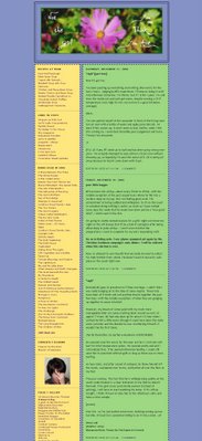
Light green and yellow columns on a sky blue background. Blurred floral header. I like the dashed borders around the page elements - it reminds me of making cut-out models while watching Blue Peter (a UK TV program) when I was much younger.

Organisation:
Yellow sidebar to the left of a green central column. The author is to be commended on her regular, often lengthy entries. A slight negative is that in some parts of the archive too many posts are showing per page. The result is that the posts run much longer than the sidebar and there is a lot of wasted space as you scroll towards the bottom. I recommend posting only 4 or 5 entries per page to keep the sidebar in proportion.

Navigation and Functionality:
Sidebar links. Blog archive at foot of page.

Advertising:
None. A totally organic and wholesome blog, which is nice to see in these days of venture capitalism.

Comments:
This is a well-established blog, dating back to March 2004. The author continues to post fairly regularly, at least twice a week. There are a few months in the archive where she has only managed one or two posts.

The first few ‘10 year catch-up’ posts provide a very useful foundation for the reader. From these we learn that Liss76 lives in Ottawa, Canada in a house and location she adores, with a husband she’s shared rocky times with, has two young children and likes cats. She met her husband at university and it was pretty much love at first sight.

The early archives are dominated by posts about her children, as you would expect from a doting mother. These are also accompanied by regular posts about cookery, book reviews and comments about the family. There is an educational element too – Liss often gives motherly advice on topics like breast-feeding and weaning. Liss76 is also partial to a good rant once in a while - these usually stem from house related troubles like when the shower breaks. Health-related posts also feature highly throughout, probably because of Liss76’s concern about her kids, particularly the youngest.

In conclusion, this is a solid ‘hobby’ blog. It is pleasing to see no commercialisation whatsoever. Liss76 only writes entries when she has something worthwhile to write about, leaving the uneventful/uninteresting days bare. Despite the attractive design, high-quality family type posts and educational nature I can’t give too high a rating because of the sparse entries in the archive.

Rating:
6/10

Reviewer:
Sam


Quick Review: londonnights.com

This post is sponsored by londonnights.com. To see our policy on sponsored entries click HERE.

London is one of the thriving tourist and economic hubs of the world. Visitors are attracted from far afield to explore the historic streets, view the famous landmarks and experience the cosmopolitan atmosphere of the city. The popularity of London makes cheap hotel rooms few and far between. Londonnights.com cuts out the stress of tracking down affordable hotel rooms in the great city. The website gives you have access to a vast choice of carefully selected and generously discounted hotels in London. When you search londonnights.com for hotels, thousands of discounted room prices are presented to you in a simple and clear format. All hotels can be booked (and cancelled) instantly - there is no waiting involved. For discount London hotels, why not give londonnights.com a try?

Quick Review: YouTube Karaoke

Those of you reading my other blog, Tom Jackson Online, a few days ago will have heard me talking about how much I like to blast out karaoke tunes, especially when slightly inebriated and surrounded by an audience of cheering (or jeering) friends. The fact that I'm a crap singer is irrelevant - it's the satisfaction of being able to raise a smile and a giggle from the unfortunates within earshot.

I mentioned the idea of posting the occasional YouTube music video and song lyrics on my other blog. It was the Girls Aloud remix of 'I Think We're Alone Now' that spurred me into this decision. The more I thought of the idea the more I liked it. After a quick Google I discovered that there is actually a gap in the market for YouTube karaoke. There is a site called YouTubeKaraoke.com but it is just a bunch of sponsored link, with no real content - certainly nothing to sing along to!

To this effect I have created a new blog called YouTube Karaoke. The tag line reads as follows: YouTube Karaoke is a collection of YouTube music videos and lyrics. The idea is that you press play, scroll to the lyrics, sing and be merry. Alcohol and an audience are optional!

So next time you've had a few drinks, a nice meal and are in the mood for a bit of a sing song, why not check out the timeless classics over at YouTube Karaoke. The site is still in development, but I'll be regularly adding to the collection. You can also submit requests by visiting the site.

Blog Review: Self-Proclaimed Supermom


Self-Proclaimed Supermom
http://selfproclaimedsupermom.typepad.com

Description of site:

Musings of a self-proclaimed Supermom. Supermom talks about her daily routine, home and family.

Appearance:
Soft pink shades, soothing and oozing with loveliness. I like the Typepad template. I know the author has considered moving to Blogger, but my advice is ‘if it isn’t broken don’t try and fix it’. I can also confirm that Blogger has certain reliability issues.

Organisation:
N/A

Navigation and Functionality:
Blog archive and sidebar links. The archive links do not extend back to the beginning of the blog, which could be confusing for some readers.

Advertising:
Directory advertising buttons on left hand sidebar. The blog doesn’t appear to be monetised at all.

Comments:
This is a requested review.

This is a well established, regularly updated blog. Just as the title implies the main content are lifestyle issues including the home, family, cookery, health and daily routine. The author talks about her children a lot which adds to the homely feel of this place.

When I review a blog one of the first things I do is go to the beginning of the archive and look at the first few posts for an introduction. The archive on the sidebar only goes back as far as February 2006, but a little deeper exploration reveals posts as far back as December 2005. Most blogs I read have an introductory post about the main characters and purpose. Sadly, Self-Proclaimed Supermom doesn’t – it’s straight down to business and not long at all until PMS and funerals are mentioned!

Despite the lack of introduction I’m sure regular readers become quite engrossed in the evolving storylines, particularly with regard to the children. The posts are well written and I think most of us can relate to the experiences of Supermom. There are names that crop up time and time again in the comments, indicative of a loyal audience hungry for the next instalment. A good mommy blog worthy of your attention.

Rating:
7/10

Reviewer:
Sam

Blog Review: Letters I Wish I'd Sent


Letters I Wish I’d Sent

http://bfwg.blogspot.com

Description of site:
Bob, the author of the site, has the urge to write letters every now and then. Mostly he writes about niggling irritations in his life, but sometimes he writes complimentary letters too. Quite often he realises there is no point in sending his letter, for fear it will simply get tied down in bureaucracy, failing to reach the intended recipient. Even if it does reach the intended recipient, there is a realisation they might just ignore his offerings. These are Bob’s thoughts on different subjects he feels strongly about.

Appearance:
One of the basic original Blogger templates. Sepia tone with background flowers. I can understand why the template has been chosen – to project an air of formality in his letters. I personally find the colour scheme slightly bland and recommend an alternative. As this is a collection of letters there are no images posted.

Organisation:
N/A

Navigation and Functionality:
Sidebar to left of page. The archive is broken down into individual days instead of months – I would change the archive format to show less detail.

Advertising:
Google AdSense ad units at the top left of sidebar. AdSense half-banner at base of page. The ads are well blended and don’t disturb the appearance of the page. A point to note is that Public Service Ads (PSAs) were showing when I viewed the site. The author will struggle to make any profit by showing PSAs. There might be a problem delivering targeted ads because of a lack of keywords in the content.

Comments:
This is a requested review.

The author has struck on a good idea here – a definite and novel theme that will run through the blog fairly timelessly. It should work well in the long term but sadly, due to the young age and limited content, it is difficult to comment in too much detail. Letters are a very personal matter and the idea of making your innermost thoughts available electronically is bound to attract a loyal audience with similar views.

The writing is of a high standard, although slightly Canadian bias – not a criticism, but it may limit the appeal of the blog outside of North America. To compliment the quality serious content there are some nuggets of humour. I particularly note the letter to Dona Highstone, commenting on how she managed to lose an election to a deceased rival and the letter to the author’s friends for asking stupid questions.

As I eluded to in the appearance comments above, I understand why the colour scheme and template were chosen – to project an air of formality in the same vain as the letters were written – but it isn’t too pleasing on the eye. I recommend migrating to Blogger in Beta for a few reasons – it has a greater range of templates, it is easier to use, has greater functionality and requires less understanding of code.

Bob, please submit this for re-review in a few months time when I can probably give a higher rating. In the meantime, at least you’ve got a little extra publicity for your work.

Rating:
5/10

Reviewer:
Tom


Blog Review: The Foo Logs


The Foo Logs

http://thefoologs.com

Description of site:
As the tag line puts it: a blog about life, technology, sport and just about everything else. From my glance over the archive The Foo Logs seems to have a particular propensity towards technology and sport related posts.

Appearance:
Attractive greens and blues with funky ‘Lost in Space’ style robots at the top of the page. I have a slight obsession with green and blue myself, so any page with this colour scheme gets off to a good start. Right hand side bar with expandable buttons.

Organisation:
Neatly organised. Generally short, bite-sized entries complimented by an image or embed.

Navigation and Functionality:
Sidebar links on expandable buttons. The expandable buttons are a good choice because of the large number of links given.

Advertising:
‘In your face’ advertising is limited to only one affiliate type button at the foot of the sidebar. The Foo Logs includes regular sponsored posts, but most of them are discreet and there are no hard-sell tactics involved. Most of them I only spotted because I dabble in sponsored posts too!

Comments:
This is a requested review.

This blog has been floating around cyberspace since May 2006. It has high quality, well-written and regular postings. The high number of comments reflects the attention it has received, and it obviously has a following of several loyal readers. The Foo Logs has been very unlucky to still have a PageRank of 0. Don’t let the low PageRank put you off – Google has obviously screwed up somewhere because The Foo Logs is a good contender. It started off slowly with half a dozen posts in the first 2 months, and it took 3 months before the first image appeared in a blog entry but since then it’s been full steam ahead. The Foo Logs is now updated nearly every day - quite often two or three times a day.

The Foo likes to weave random humour into his posts. Quite often his dry wit makes you question ‘is this or isn’t it a joke?’ and you need to think around the subject to work it out. Another key component of the blog is the use of cartoon images. He also includes educational posts – whether it’s comments about abstract art, or tricks to help your maths. The Foo is also a regular participant in ‘Wordless Wednesday’ and has posted some very thought-provoking images in that role. There are also regular YouTube embeds (the Borat and Letterman collection brought a wry smile to my face) and guest posters.

Overall this is a well-written, diverse blog which is interspersed with humour and images to keep the reader’s attention. I shall definitely be book marking it for future reference.

Rating:
7/10

Reviewer:
Tom


Quick Review: National Payday

This post is sponsored by National Payday. To see our policy on sponsored entries click HERE.

If you are short of cash leading up to Christmas you might like to visit National Payday and see what they have to offer. National Payday offer cash advances and payday loans to all sorts of people - even those with a bad credit history. As a first time borrower you can get a loan of up to USD $300, which increases up to USD $600 if you use the service again. If you complete the simple online application form you can be approved and receive your payment the next business day. If you could do with a small injection of cash National Payday could be for you.

Blog Review: Aeowolf Online


Aeowolf
Online

http://aeowolf.blogspot.com

Description of site:
The author gives his personal opinions on the day’s events, art, literature, current affairs, politics and lifestyle issues. A magazine type blog with diverse content.

Appearance:
The original Blogger’s plain template with royal blue and white colour scheme. Bite size chunks of text normally accompanied by an image.

Organisation:
N/A

Navigation and Functionality:
Sidebar links and drop down blog archive. The drop down style is archive is a good choice because the side bar is already quite busy.

Advertising:
Google AdSense for search bar and ad units on right hand side bar. Adbrite ad unit at base of side bar. Various affiliate buttons confined to side bar and foot of page. In general the ads are well blended and do not interfere with reading or appearance.

Comments:
Aeowolf Online represents quite a milestone for Soapbox Jury because it is our first requested review.

One thing that instantly attracts me to this blog is the easy reading. The author concentrates on one topic per posting, usually achieving this in only one paragraph and one image. Again we are confronted by a diverse range of content covering current affairs, art, literature, religion, computing and even politics. By far the biggest contribution is personal ramblings, exactly as it says on the tin. Unlike other personal blogs I’ve read there isn’t a particular theme – posts tend to flit randomly from one extreme to the next instead of building up a slow and progressive story over successive days. The posts are well written – short, concise and if necessary well-reasoned. One minor criticism is that the author posts quite irregularly – sometimes only once or twice a week. It’s possible returning visitors are confronted by the same post on several occasions. It is always a good idea to post several times a week so that the content is fresh – a trick I have used is to keep a few pre-written short posts in reserve for days when I am too short of time. Overall, a good blog with sound presentation, well written and researched content and a steady readership.

Rating:
7/10

Reviewer:
Sam

Blog Review: Mad Baggage


Mad Baggage

http://madbaggagerambling.blogspot.com

Description of site:
Daily snippets of life from Cheryl of East Sussex in the UK. Cheryl mainly talks about general lifestyle issues and occasionally posts trivia, poetry and political comment.

Appearance:
Blogger’s standard rounders template with violet and light grey colour scheme. Small chunks of text with the odd image thrown in.

Organisation:
N/A

Navigation and Functionality:
Sidebar links and blog archive.

Advertising:
Google AdSense leaderboard at very foot of page.

Comments:
The first impression of Mad Baggage is that there is a lot of text and very few images. Cheryl’s style of writing is very thought provoking and descriptive. The main content seems to be lifestyle issues – family, health, pets and the home. When it comes to current affairs it’s a serious blog that makes mention of topical issues – however, every so often there is a real nugget of humour. There are some particularly funny YouTube embeds lurking about in here too. I also like the ‘Free Association’ series of posts – Cheryl thinks of a few random words and writes a few comments about them. Kind of word brainstorming. With a varied range of content and regular updating this is a sound blog.

Rating:
7/10

Reviewer:
Sam

TV Preview: I'm A Celebrity - Get Me Out Of Here!

Celebrity deadbeats - luckily the producers had the
presence of thought to put names to faces on the picture above.

There is a famous quote by Paul McCartney: asked something like what are the chances of the Beatles getting back together? McCartney replied "you can't reheat a souffle". Excuse the absence of the French accent above the 'e' in souffle. Never has a truer word been spoken in relation to I'm A Celebrity - Get Me Out of Here! Brain rot telly hits the screens of ITV1 tonight at 9 pm. If you're not in the UK, lucky you - you can watch the Paint Drying Channel instead with equal gusto.

The original concept was solid enough - take some celebs, strip them of all their worldly possessions then dump them in a forest somewhere with primitive equipment and basic food. Every so often make them do humiliating tasks, usually the consumption of creepy crawlies or animal testis, to earn extra food and a warm glow of satisfaction that they have fed their fellow celebs. The first series wasn't too bad either, but it's gone down hill ever since then - now in series 5 we hit rock bottom.

The show now recruits has beens who are desperate to rekindle their fame and fortune. They are less interested in the participative spirit of the programme, more interested in making unreasonable demands of the producers and hogging the limelight.

So which 'celebrities' have ITV wheeled out for the latest outback jungle adventure? Well, we have Toby Anstis, a famous TV presenter who reached his pinnacle about 10 years ago on Children's BBC; Jason Donovan, the ugly part of the Neighbours duo, former coke head and untalented singer of the late 1980s; David Gest, plastic faced Michael Jackson impersonator and ex-husband of singer/actress Liza Minelli; Jan Leeming, BBC News reader from the Frank Bough era; Lauren Booth, outspoken loony-lefty half sister of frog-faced Prime Minister's wife Cherie Blair and Myleene Klass, sex kitten of the now defunct manufactured pop group Hear Say and now classical solo singer. There's two others who I've never heard of.

Apart from Myleene Klass (possibly, but maybe I'm biased because she's hot) I don't know how any of them can be described as a celebrity - a celebrity to me is someone who is in the public spotlight, frequently in the papers and whose name and face 95% of the population will recognise.

There is far too much of this microwave TV on the airwaves nowadays. The TV companies think that if a format has worked before you can reheat it, serve it out to the public and it's a hearty meal for the viewer's hungry appetite. Actually it's a load of bollocks. The BBC and Channel 4 are doing exactly the same thing with Strictly Come Dancing and Big Brother respectively. What they should be doing is investing in novel British drama and documentaries - supporting the local up and coming television industry instead of buying prepacked tripe.

End of rant. I think you get the gist that I'll not be watching it.

Blog Review: ducking for apples


ducking for apples

http://duckingforapples.blogspot.com

Description of site:
Daily musings of Ally, a 30 something year old self-employed IT consultant from North Wales.

Appearance:
A recurring appley theme – many half eaten apple pictures. I’m sure there must be some significance to Ally although I can’t quite tell what it is apart from she likes the countryside, garden and outdoor lifestyle. Perhaps she likes eating apples too?

Organisation:
Spartan. Neat layout. Very few images in the posts, but this is compensated for by the high quality of writing.

Navigation and Functionality:
Sidebar links and blog archive.

Advertising:
None.

Comments:
This is a top blog - no mistakes about it. The first place I headed on my whistle-stop tour of ducking for apples was the first post, right back in July 2004. It is a true veteran of a blog – long-lived, hard working and dependable with a few interesting tales to tell. In her very first post Ally introduces the ‘crew’ – all those people likely to crop up in her adventures in the coming months, which is a marvellous stroke of foresight. The cast includes a Polish lodger, Polish lodger’s ex girlfriend, new Polish lodger, invisible lodger, Polish lodger’s ex-girlfriend’s cousin and several other intriguing characters. After all this Cluedo like build up I was absolutely itching to see what lurked in the depths of the archive. I wasn't disappointed.

Ally has written some absolutely side-splittingly funny posts. Most of them aren’t about subjects that are funny in themselves, but the way she interjects punchy comments, nicknames, side swipes and double entendre is hilarious. There are too many quality entries to single out any one in particular, but I like those where she recounts funny conversations she’s had earlier in the day. Ally has a real gift for holding the reader’s attention and I can’t recommend this blog highly enough.

Rating:
9/10 – the blog’s bollocks!

Reviewer:
Tom

Blog Review: Olivia's London Dispatches


Olivia’
s London Dispatches

http://artmeliana.blogspot.com

Description of site:
An insight into the everyday life of Olivia, an art history graduate finding her feet in London. Olivia guides the reader through an eclectic mix of art, poetry, literature, partying and shopping.

Appearance:
Pale lavender shades with elegant floral header.

Organisation:
The page elements neatly arranged on a left hand side bar. There is a balanced mix of text and images in the blog entries.

Navigation and Functionality:
Sidebar links and blog archive.

Advertising:
Some discreet affiliate advertising buttons are located at the base of the side bar. These don’t interrupt the continuity or appearance of the page.

Comments:
This is a solid blog – pleasing on the eye, good writing, a few interesting photos and, particularly important from my point of view, some educational value. The ‘enrichment’ on the sidebar is a nice touch. It gives details of a word of the day, article of the day, birthday and quotation of the day. The blog entries are mainly about Olivia’s daily routine but these are complimented by frequent mentions of poetry, art, literature and entertainment. The blog is updated two or three times a week.

A minor observation is that some photographs and enrichment elements overspill from their frames. Even though this doesn’t detract from the appearance of the page it would be nice if this could be corrected, although I’m not sure if this is possible.

Rating:
7/10

Reviewer:
Tom

Blog Review: adformula


adformula

http://adformula.blogspot.com

Description of site:
A collection of posts vaguely related to advertising.

Appearance:
Very, very basic monotone template. Page elements in no particular order.

Organisation:
Very poorly organised. Blog archive positioned at foot of page well away from main content. No use of a sidebar.

Navigation and Functionality:
Very basic. Links and blog archive located at bottom of page.

Advertising:
Google AdSense in various positions. No effort has been made to blend the ads to the underlying page background. Quite often the ads are obtrusive and distracting.

Comments:

We go from one extreme to the other in today’s reviews. This site is absolutely diabolical – there is no other word for it. The first thing that hits you is that the most boring template ever, a delightful snot green monotone, has been used. After only 5 seconds of reading you realise the posts are off-subject, poorly written and full of grammatical errors. No consideration has been given to the position of page elements – a classic example is the archive list right down at the bottom of the page, miles away from any post content. The author has also gone way overboard with the advertising – AdSense all over the place, none of which is blended. As if things aren’t bad enough already my eyes get sore from trying to read the unequal length lines of text. God knows how it managed to get a PageRank of 4 - the author must be spamming forums and message boards all over the place. I’d confine this blog to the recycle bin to put it out of its misery.

Rating:
1/10

Reviewer:
Tom

Blog Review: Green - A New Beginning


Green – A New Beginning

http://peaceful-catastrophe.blogspot.com

Description of site:
Daily musings of a Bristol nursery nurse in her early 20’s called Rachael. Rache gives a candid, down to earth insight into the trials and tribulations of her everyday life. She also keeps her readers informed of her daily routine, aspirations and innermost thoughts.

Appearance:

As the title suggests, quite green. Soothing appearance which is natural and easy on the eye.

Organisation:
Neatly arranged with short paragraphs interspersed with images.

Navigation and Functionality:

Sidebar links and blog archive.

Advertising:

None.

Comments:

This blog was originally on Tom’s to do list but he told me he was ‘unable to give an impartial opinion because of Rache’s beautiful long red hair’ – well, whatever floats your boat Tom! As I sit down and read the entries I see a refreshingly honest account of Rache’s struggle to find a permanent job, security and long term happiness. It’s really more of an online diary than log – she endears herself to a loyal following of readers by her chatty, quirky and punchy comments. The posts cover a diverse range of topics, all of which can be related to by the reader. There are also a surprising number of cooking tips and ideas! I think Rache has a slightly mischievous streak and a warm, dry sense of humour is evident in her style of writing. Green also floats my boat – I can see how Tom instantly warmed to it.

Rating:
9/10 - the blog’s bollocks!

Reviewer:
Sam

Blog Review: Nature's Wallpaper


Nature’s Wallpaper
http://natureswallpaper.blogspot.com

Description of site:
The author has taken photographs of various plants, animals and landscapes in North America. An entry containing a new photograph and brief annotation is made nearly every day.

Appearance:
In a word, minimalist. A very simple template has been used. The page background is black which tends to contrast, sometimes distractingly so, with objects placed on top. This is particularly evident with the white and blue AdSense referral buttons which ‘stick out like a sore thumb’.

Organisation:
N/A

Navigation and Functionality:
Side bar links and blog archive.

Advertising:
Google AdSense referral buttons at top, side and search bar at bottom of page. There are also several affiliate type adverts. No effort has been made to blend the ads with the page – as if the author is trying too hard to attract attention to them.

Comments:
The photographer obviously has a very keen eye and has taken some beautiful shots, some of them in very fine detail. I particularly like the vibrant colours of the plants and close ups of the insects. The images on here would make a fantastic slide show, but as it is I can’t ignore the canvas underneath – I just can’t figure out why someone with such artistic flair would choose a black background with horribly contrasting embeds. I would have chosen a pastel green or blue to reflect the nature theme of the photos.

Rating:
6/10

Reviewer:
Sam

Movie Review: Saw III

I'm not an avid follower of the Saw series of movies but after reading about several cinema goers needing medical attention after seeing Saw III I thought it was worth a look.


With his new apprentice Jigsaw, the puppet-master behind the cruel, intricate games that have terrified a community and baffled police, has once again evaded capture and vanished. Amanda, Jigsaw's apprentice is asked by Jigsaw to capture Dr. Lynn Denlon to keep Jigsaw alive for one final test. While Jeff is faced with a difficult situation of his own trapped in a freezer, only getting colder by the second, he must decide whether or not to save another of Jigsaw's victims Denica.

Probably the best psychological horror released this year, Saw III is definitely worth a look if you're not too squeamish.

Blog Review: Name that Tube


Name that Tube

http://namethattube.blogspot.com

Description of site:
The author poses a daily challenge to guess which London Underground station is depicted in the blog entry. Each image is accompanied by a small hint, description or comment about the author’s day so far.

Appearance:
One of the standard Blogger rounders templates has been used, so not too much to comment on. If this had been my site I would have adjusted the AdSense colour palette so that it blended in with the background more.

Organisation:
N/A

Navigation and Functionality:
Side bar links and blog archive.

Advertising:
Google AdSense in the side bar and at the foot of the page. This advertising is unobtrusive, despite not being very well blended and doesn’t detract from the site content or appearance.

Comments:
This is a very simple idea, as most of the good ones are. The author sits with a tube map, picks a random station and does a Google image search or similar on the station name – a ready made blog entry in very little time and effort. This is also an easy blog to maintain – no fancy graphics or special effects, just the bare minimum needed to fulfil the aim. I’m almost jealous I didn’t think of it first!

Rating:
8/10

Reviewer:
Tom


Blog Review: Adopt a Microbe


Adopt a Microbe
http://adoptamicrobe.blogspot.com

Description of site:
The author guides visitors through the interesting world of micro organisms, particularly those detrimental to human health. Each blog entry relates to a different microbe and is illustrated with a small cartoon character of the microbe concerned. The entries are written as if the microbe is describing itself to the audience.

Appearance:
This blog uses natural colours that are easy on the eye. The entries are short, concise and easy to read. The author has judged the balance of text and images just right.

Organisation:
N/A

Navigation and Functionality:
Side bar links and blog archive.

Advertising:
N/A

Comments:
The use of cartoon characters and simple language brings this complicated subject down to an understandable level which will appeal to most readers. I think Adopt a Microbe is particularly well suited to children because of its short, easy to read entries and cartoon characters which the young will relate to. The site is still relatively new (started June 2006) which is reflected by a PageRank of 0. The author is commended on the regularity of her updates. I would recommend this site to anyone with the slightest interest in science and nature.

Rating:
8/10

Reviewer:
Tom